The Beginner’s Guide to Line Weight: 7 Inking Secrets That Make Flat Drawings Pop
Have you ever spent twenty minutes sketching a lively pencil drawing that felt full of charm and personality, only to trace over it with a black pen and watch the magic evaporate? Suddenly, your dynamic character looks like a stiff coloring-book outline, your cozy food doodle looks flat as cardboard, and the drawing feels robotic.
If that sounds painfully familiar, do not worry—your drawing isn’t broken, and your hands aren’t clumsy. You’ve simply encountered The Monoline Trap. The difference between an amateur outline and a drawing that leaps right off the page boils down to a single transformative skill: Line Weight.
What Exactly Is Line Weight (And Why Does Your Brain Love It)?
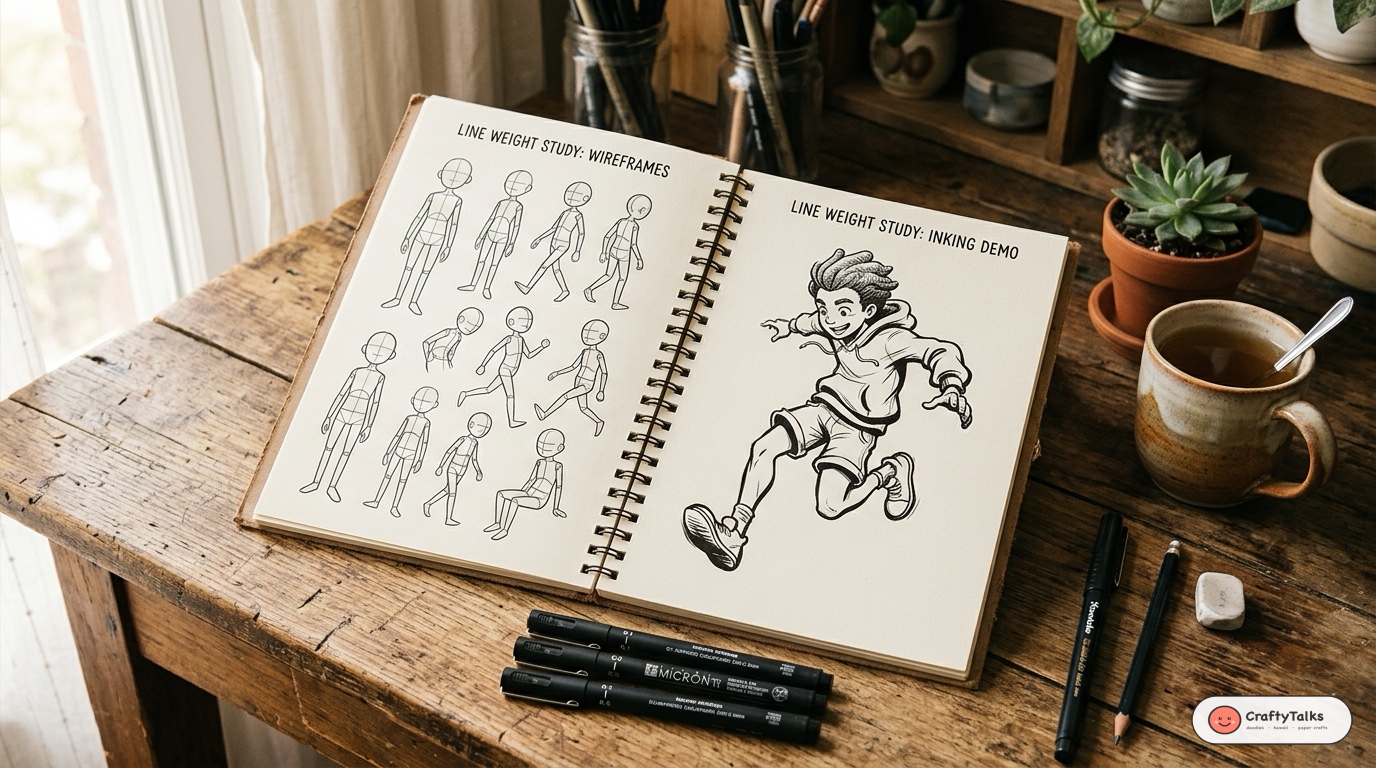
Line weight simply refers to the relative thickness or thinness of a drawn line. In the real physical world, outlines do not exist—objects are defined by contrasting planes of light, cast shadows, and edges of mass. Because drawings compress a 3D world into a 2D sheet of paper, your brain relies on line thickness as a visual shorthand for three crucial physical sensations:
1. ⚖️ Physical Gravity
Heavier lines at the bottom of an object trick the viewer’s subconscious into feeling the downward pull of gravity, making your characters feel grounded rather than floating helplessly.
2. ☀️ Light & Shadow
Thinner lines facing a light source suggest glowing highlights, while thicker lines tucked on the underside suggest cast shadows and recessed depth.
3. 🔭 Spatial Proximity
Thicker strokes naturally advance toward the viewer’s eye, while delicate whisper lines recede into the distance, establishing instant atmospheric perspective.
The 7 Inking Secrets That Make Your Drawings Pop
1. The 3-Tier Line Hierarchy Rule
The single biggest mistake beginners make is inking an entire drawing with a single pen size (like drawing everything with a 0.5mm fineliner). Professional cartoonists and illustrators always work with a three-tier pen hierarchy:
- Heavy Tier (0.7mm – 1.0mm or Brush Pen): Reserved exclusively for the outer perimeter silhouette. This “contains” the character and locks the shape against the background.
- Medium Tier (0.3mm – 0.5mm): Used for major interior architectural seams—overlapping clothing folds, limbs crossing in front of bodies, jawlines, and heavy wrinkles.
- Whisper Tier (0.05mm – 0.1mm): Used for delicate texture, facial expression wrinkles, hair strands, fabric stitching, and subtle stippling.
When you look at our character lessons—like how to draw a noble cartoon lion or our gentle cartoon giraffe guide—notice how the outer contour holds the shape together while the inner details stay delightfully light!
2. The “Corner Hug” (Ambient Occlusion)
In physics, when two physical surfaces meet at a tight junction or crevice (like where an armpit meets a torso, or where a collar rests against a neck), light particles struggle to bounce inside. This creates a natural pocket of darkness called ambient occlusion.
Whenever two lines intersect or form a sharp inner corner, do not leave it as a bare crosshair. Thicken and round out the junction with a small crescent of ink. This tiny wedge of black creates instant tactile depth and makes your ink look rich, organic, and intentional.
3. The Underside Gravity Principle
Whenever you are in doubt about where to make a line thicker, follow this universal golden rule: Bottom edges are thick, top edges are thin.
Imagine sunlight streaming from the ceiling: the top of a character’s head, shoulders, and outstretched paws receive direct rays (ink them with a light 0.2mm stroke). The chin, underbelly, soles of the feet, and bottom curves of folds fall into shadow (bulk them up with a bold 0.8mm stroke). Even without color or shading, your drawing instantly conveys believable three-dimensional volume!
4. Foreground Priority Overlapping
When one body part or object sits in front of another, the foreground object must visually overpower the background object. If a character is pointing forward or kicking toward the camera, bulk up the line weight of the closer limb.
In our cute food art—like our cute ramen bowl doodle—the chopsticks crossing in front of the rim receive a heavier outline than the rim beneath them. This visual cue tells the viewer’s brain exactly what is near and what is far without needing complex rendering.
5. Velocity Kills the Wobble (Draw with Your Shoulder)
Why do beginner ink lines often look jittery and hesitant? Because artists draw too slowly, gripping the pen with white knuckles and drawing entirely from their wrist or fingers!
Confident, dynamic line weight requires stroke velocity. Lock your wrist in place and power your pen strokes from your elbow and shoulder. Move your hand across the page with brisk, decisive momentum. Fast lines naturally taper gracefully at the entry and exit points, giving your linework an athletic, fluid sweep.
6. The Tapered Feather Release
A beautiful line should rarely start or end as a blunt, abrupt stump. Practice the landing-and-takeoff technique, exactly like an airplane touching down on a runway:
- Touchdown: The pen tip meets the paper on a gentle forward glide (thin).
- Pressure: You press down into the surface at the apex of the curve to lay down rich ink (thick).
- Liftoff: You flick the pen forward and upward into the air as the stroke concludes (tapered needle tip).
This single flick motion is what gives Japanese manga line art, Disney character animation, and aesthetic sketchbook drawings their signature grace.
7. Never Outline Blindly: Choose What NOT to Ink
The greatest inkers know that empty space is just as powerful as black ink. You do not need to connect every single line into an unbroken wire cage. Leaving intentional gaps in your outlines—known as “lost edges”—allows the viewer’s brain to complete the shape while suggesting blinding light, softness, or delicate texture.
Leave breaks along the sunlit crests of clothing folds, fluffy animal fur cheeks, or the highlighted rim of a ceramic cup. The drawing breathes, feels organic, and loses the sterile stiffness of computer vectors.
The Artist’s Inking Toolkit: Which Pens Should You Choose?
🖋️ Technical Fineliners
Best For: Beginners, Doodles, Architectural Accuracy
Brands like Sakura Pigma Micron, Uni-ball Pin, and Staedtler Pigment Liners. They produce clean, uniform lines that never bleed. To create line weight with fineliners, use a multi-pass technique or keep a 0.1, 0.3, and 0.8 on hand.
🖌️ Brush Pens
Best For: Expressive Characters, Organic Curves, Dynamic Energy
Tools like the Pentel Pocket Brush Pen or Tombow Fudenosuke. Flexible nylon bristles or elastomeric tips respond instantly to pressure, moving from a hairline whisper to a thick 3mm stroke in a single fluid gesture.
3 Daily 5-Minute Inking Drills to Build Muscle Memory
Drill 1: The Ribbon Whip
Draw 10 smooth S-curves across a blank page. Start with zero pressure, press hard in the middle belly of the curve to dump ink, then flick upward to a tapered point. Repeat until your curves flow effortlessly without jitter.
Drill 2: The Crevice Punch
Sketch a grid of 6 overlapping simple cubes or bean shapes. With your pen, darken only the tight interior crevices where corners touch. Watch how two overlapping flat shapes instantly pop forward into 3D space.
Drill 3: The Balloon Silhouette
Draw 5 round cartoon balloons or fruit shapes. Keep the top sunlit rim whisper thin (0.1mm), and build the bottom contour into a bold, thick anchor (0.8mm). Notice how heavy and grounded the shapes feel.
Ready to Put Line Weight into Practice?
The best way to master line weight is to practice on fun, low-pressure sketches! Explore our daily drawing tutorials and sketchbook routines to put these principles to work right now:
- 📖 The 5-Minute Cozy Sketchbook Routine: How to overcome fear of the blank page and draw every single day.
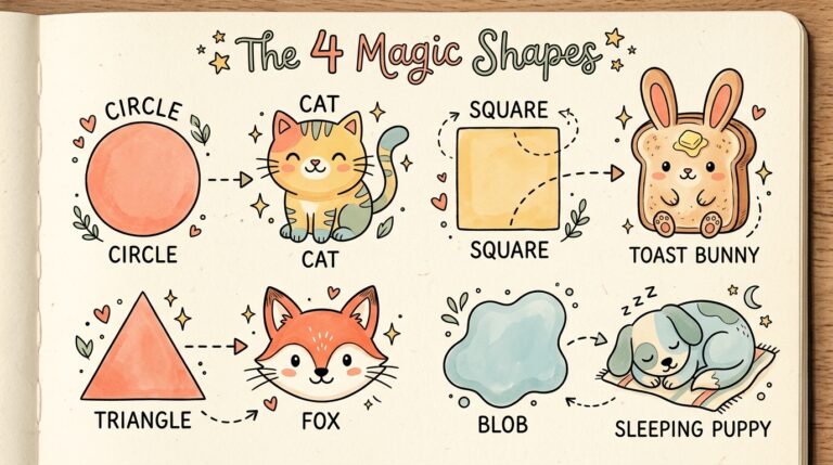
- 🎨 The 4 Magic Shapes Guide: How to construct any animal or character by starting with simple primitives.
- 🦁 How to Draw a Noble Cartoon Lion: Practice weighted mane curves and confident character silhouettes.
- 🍜 How to Draw a Cute Ramen Bowl Doodle: Test your thin noodle texture against bold ceramic bowl contours!
📌 Save This Inking Guide on Pinterest!
Found these line weight tips helpful? Pin this master guide to your Drawing Tips, Inking Techniques, or Art Sketchbook board on Pinterest to revisit whenever you pick up your pens!